This document provides an overview of various input types used in our application. Each input type includes a brief description, an image of the UI component, and the settings object that defines it.
How to use these
-
Define the Settings.
Use the providedsettingsobject as a template to define the properties (props) and their configurations. -
Customize as Needed.
Modify thelabel,id,type,default,info, andoptionsfields to suit your requirements. -
Handle the Data.
In your component, access the input values likeprops[id].valueand implement the necessary logic to build your components.
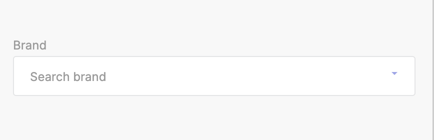
Brand
A dropdown selection for choosing a brand from the list.
Preview
Settings Object
export const settings = {
    label: "Brand Selector",
    props: [
        {
            id: "brand",
            label: "Brand",
            type: "brand",
            default: "",
            info: "Search Brand",
        },
    ],
    blocks: [],
};
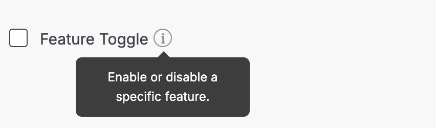
Checkbox
A checkbox input for enabling or disabling a feature.
Preview
Settings Object
export const settings = {
    label: "Checkbox Input",
    props: [
        {
            id: "featureToggle",
            label: "Feature Toggle",
            type: "checkbox",
            default: false,
            info: "Enable or disable a specific feature.",
        },
    ],
    blocks: [],
};
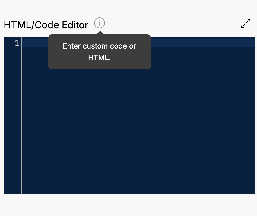
Code
An input area for entering custom code or HTML.
Preview
Settings Object
export const settings = {
    label: "Code Editor",
    props: [
        {
            id: "htmlCodeInput",
            label: "HTML/Code Editor",
            type: "code",
            default: "",
            info: "Enter custom code or HTML.",
        },
    ],
    blocks: [],
};
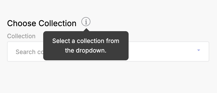
Collection
A dropdown selection for choosing a collection from the list.
Preview
Settings Object
export const settings = {
    label: "Collection Selector",
    props: [
        {
            id: "collectionSelection",
            label: "Choose Collection",
            type: "collection",
            default: "",
            info: "Select a collection from the dropdown.",
        },
    ],
    blocks: [],
};
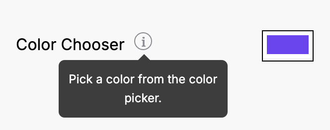
Color
A color picker for selecting a color value.
Preview
Settings Object
export const settings = {
    label: "Color Picker",
    props: [
        {
            id: "colorPicker",
            label: "Color Chooser",
            type: "color",
            default: "#7043F7",
            info: "Pick a color from the color picker."
        },
    ],
    blocks: [],
};
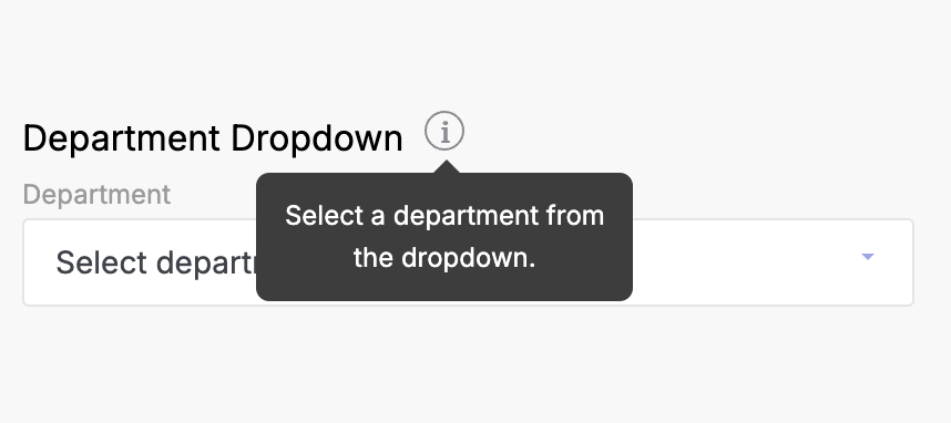
Department
A dropdown selection for choosing a department from the list.
Preview
Settings Object
export const settings = {
    label: "Department Selector",
    props: [
        {
            id: "departmentSelection",
            label: "Department Dropdown",
            type: "department",
            default: "",
            info: "Select a department from the dropdown.",
        },
    ],
    blocks: [],
};
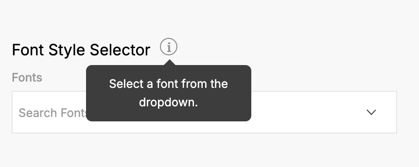
Font
An input for selecting font settings.
Preview
 )
)
Settings Object
export const settings = {
    label: "Font Selector",
    props: [
        {
            id: "fontSelector",
            label: "Font Style Selector",
            type: "font",
            default: "Arial",
            info: "Select a font from the dropdown.",
        },
    ],
    blocks: [],
};
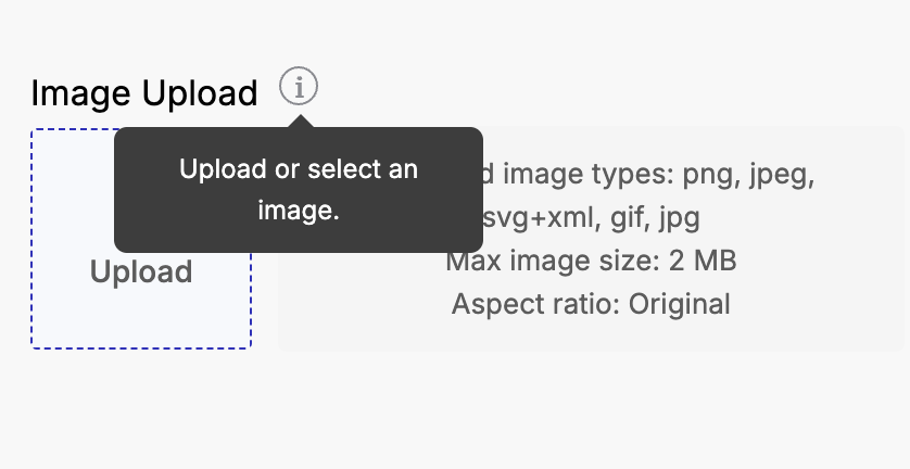
Image Picker
An interface for uploading or selecting an image.
Preview
Settings Object
export const settings = {
    label: "Image Picker",
    props: [
        {
            id: "imageUploader",
            label: "Image Upload",
            type: "image_picker",
            default: "",
            info: "Upload or select an image.",
            options: {
                maxSize: 2048,
                file_types: ["png", "jpeg", "svg+xml"],
                aspect_ratio: 1,
                aspect_ratio_strict_check: false,
                min_resolution: { width: 100, height: 100 },
                max_resolution: { width: 2000, height: 2000 },
            },
        },
    ],
    blocks: [],
};
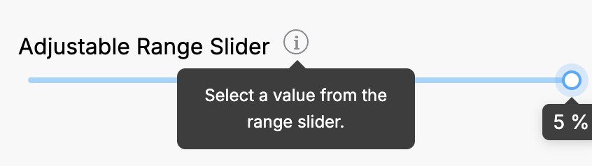
Range
A slider input for selecting a numerical value within a range.
Preview
Settings Object
export const settings = {
    label: "Range Slider",
    props: [
        {
            id: "rangeSlider",
            label: "Adjustable Range Slider",
            type: "range",
            default: 5,
            info: "Select a value from the range slider.",
            min: 0,
            max: 5,
            step: 1,
            unit: "%",
        },
    ],
    blocks: [],
};
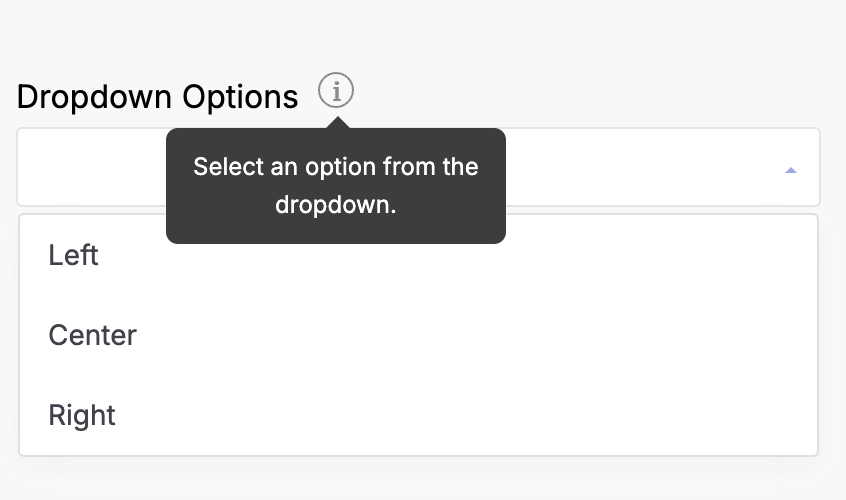
Select
A dropdown selection for choosing an option from a provided list.
Preview
Settings Object
export const settings = {
    label: "Select Input",
    props: [
        {
            id: "dropdownSelector",
            label: "Dropdown Options",
            type: "select",
            default: "",
            info: "Select an option from the dropdown.",
            options: [
                { text: "Left", value: "L" },
                { text: "Center", value: "C" },
                { text: "Right", value: "R" },
            ],
        },
    ],
    blocks: [],
};
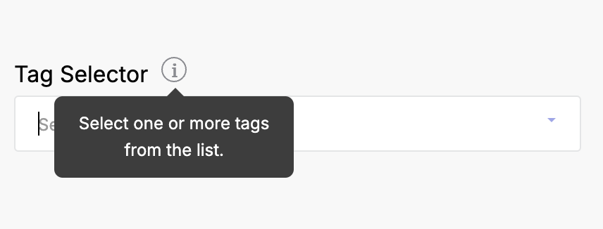
Tags List
An input that allows the user to select multiple tags from a list, with search functionality.
Preview
 )
)
Settings Object
export const settings = {
    label: "Tags List",
    props: [
        {
            id: "tagsPicker",
            label: "Tag Selector",
            type: "tags-list",
            default: [],
            info: "Select one or more tags from the list.",
        },
    ],
    blocks: [],
};
Text
A single-line text input for entering short text, such as names or titles.
Preview
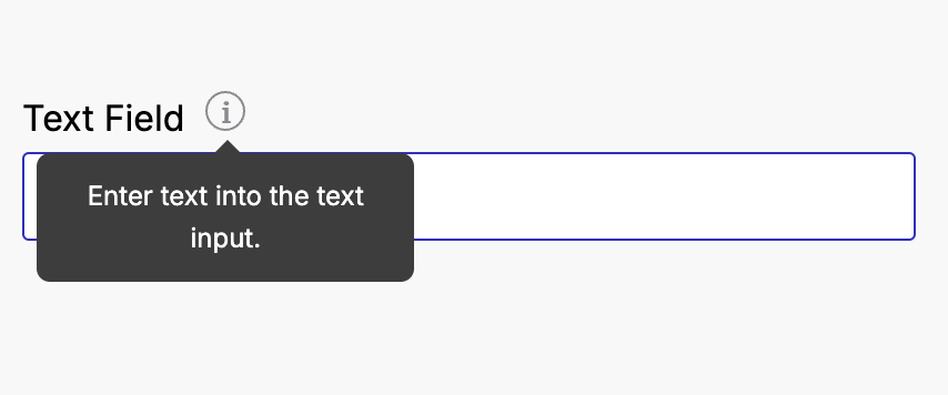
Settings Object
export const settings = {
    label: "Text Input",
    props: [
        {
            id: "textInput",
            label: "Text Field",
            type: "text",
            default: "",
            info: "Enter text into the text input.",
        },
    ],
    blocks: [],
};
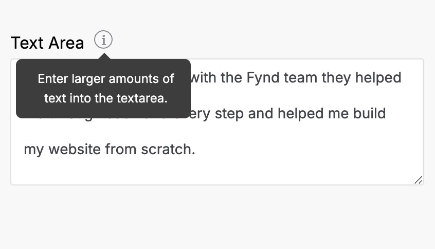
Textarea
A multi-line text input for entering larger amounts of text.
Preview
Settings Object
export const settings = {
    label: "Textarea Input",
    props: [
        {
            id: "multilineText",
            label: "Text Area",
            type: "textarea",
            default:
                "It was amazing working with the Fynd team they helped me through each and every step and helped me build my website from scratch.",
            info: "Enter larger amounts of text into the textarea.",
        },
    ],
    blocks: [],
};
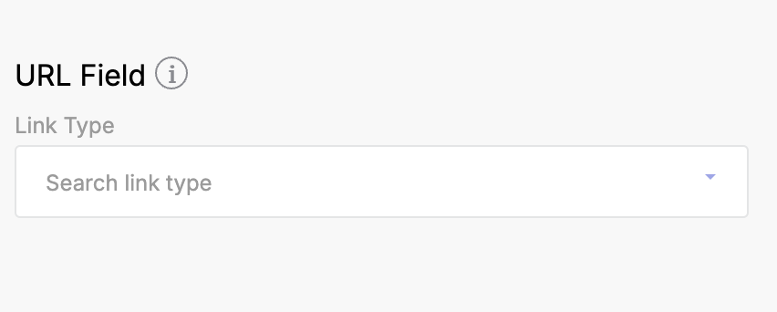
URL
An input for entering or building URLs.
Preview
Settings Object
export const settings = {
    label: "URL Input",
    props: [
        {
            id: "urlInput",
            label: "URL Field",
            type: "url",
            default: "",
            info: "Enter or build a URL.",
        },
    ],
    blocks: [],
};
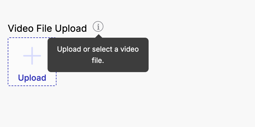
Video
An input for uploading or selecting a video file.
Preview
Settings Object
export const settings = {
    label: "Video Input",
    props: [
        {
            id: "videoUploader",
            label: "Video File Upload",
            type: "video",
            default: "",
            info: "Upload or select a video file.",
            options: {
                fileTypes: ["mp4"],
            },
        },
    ],
    blocks: [],
};